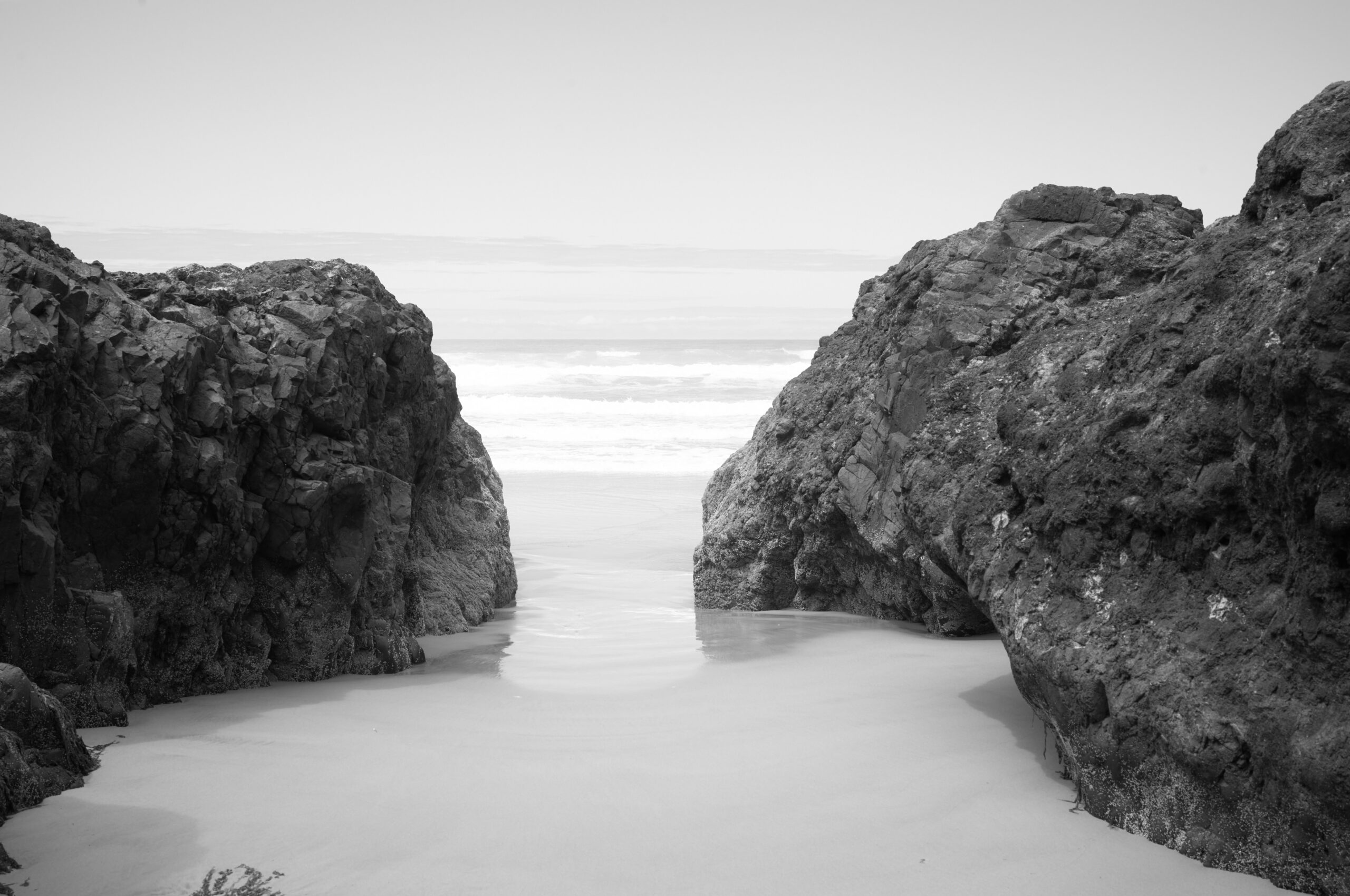
This won’t be my last photo from Neptune North.
I think this is from my first actual outing with this camera. My plan was to use the overhead mid-day light and the strong contrast of the rocks and sand at Neptune North to text exposure methods. To find a good method for exposure to protect highlights without resorting to massive underexposure. Most modern ISO-invariant sensors can handle several stops of underexposure. I prefer to keep the curve as far to the right as possible. It removes removes a step or two from the post-processing flow. I did blow the highlights just a bit in this image, but I’m not going to lose sleep over it. I learned where the highlight limit is when spot-metering. The other part of my plan was to test how much dynamic range was practically available from a monochrome sensor. Turns out, a ton, more than I need most of the time.
It’s a little hard to explain, but editing files from this camera is different. It feels more like working with a medium format negative in the darkroom. I’ll try to find a good way to explain that as I work more with this camera. I guess in a nutshell the files have so much dynamic range and so much detail that you have to make a lot of very intentional choices when editing, and you do have to edit these files. Raw files from this camera are flat and lifeless, and the meter defaults to underexposure to protect highlights, so the raw images are often very dark.
This is similar to printing a well exposed and developed negative in the darkroom. A well exposed and developed negative usually has more dynamic range than you need. So, the goal in printing is to decide how bright you want your highlights and how dark you want your shadows and print accordingly. There are several tools to manipulate shadows and highlights in the darkroom. You may have heard of dodging and burning – tools and language that continues to be available in modern photo editing software. But there is a more fundamental control that applies to the contrast of the paper itself, contrast grades.
In straight (no dodging and burning) black and white printing the contrast grade of the paper determines how dark your shadows will be at a given highlight brightness. Highlight and shadow levels are often called density, as in density of developed silver crystals on the paper. The more dense the shadow the darker it is. The less dense the highlight is, the brighter it is. Higher contrast paper means blacker blacks at a given highlight brightness. Choosing the right paper contrast grade is the first step and it makes everything that follows easier.
Anyway, the point is that the negative always has more than you need, just like the files from a monochrome sensor.